

One of the most interesting projects that a graphic designer can accept, is designing a logo, but a big challenge is to design your own logo.
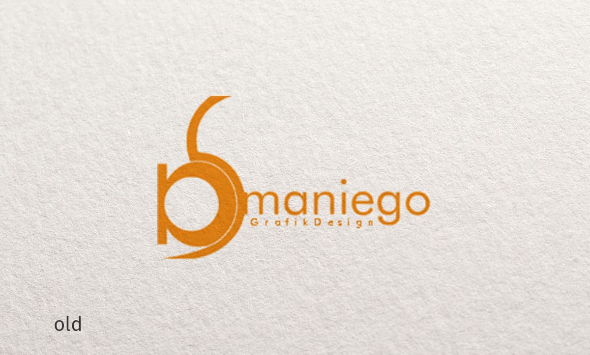
For some months I was playing with the idea of creating a modern, timeless and simple logo for myself. The old logo has nothing to do with the concepts I stand for today. As a Graphic Designer Digital I follow the new digital trends and technologies. That’s exactly what I wanted to represent.
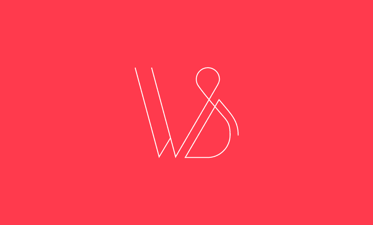
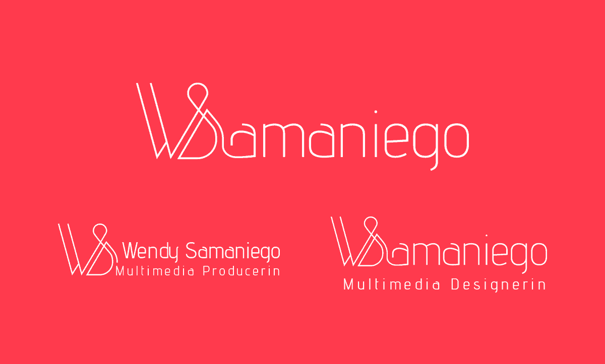
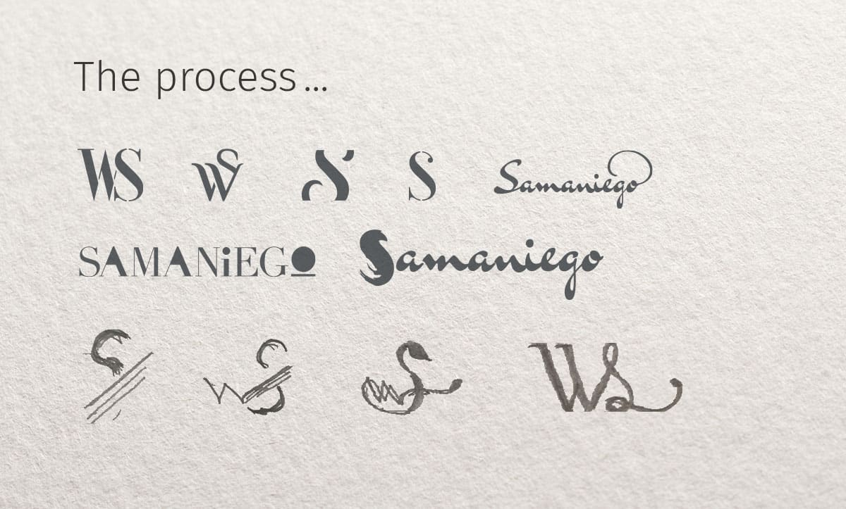
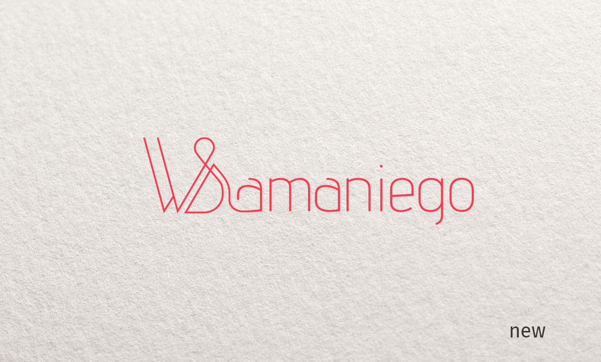
As with my old logo, I really wanted to continue working with my name. It had to be playful but elegant. The new logo should work with the letter W, S or both and the whole name Samaniego.
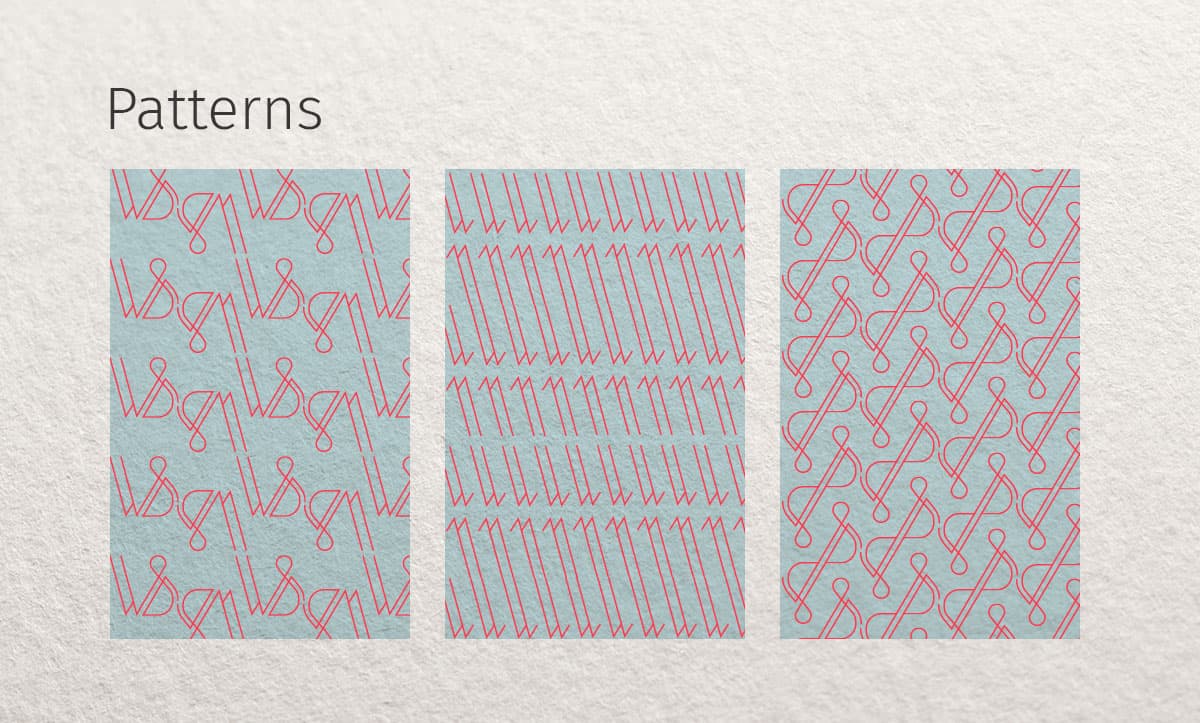
I wanted to have a mix between lines and curves. The lines stand for the simplicity and the curve for the versatility of my work. It should be very clean.
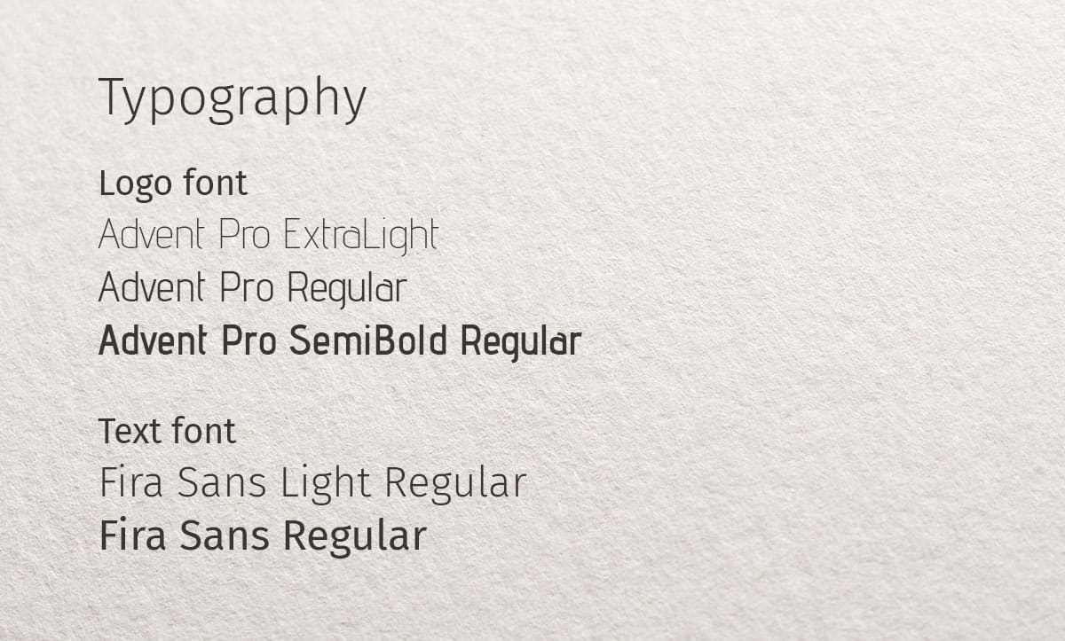
At first, I just took the W (Wendy) for it, then the S (Samaniego) … but both letters gave exactly what I wanted. Then I should insert my family name… I started looking for the right typography. The typography must have many curves.
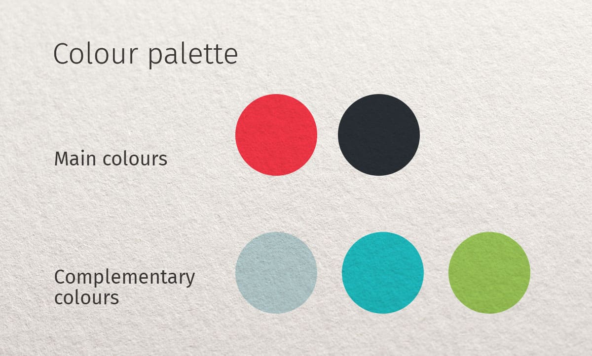
At the end I chose the colours.
As main colours:
Medium dark Coral to show attention, dynamism, energy and curiosity.
Dark blue-grey stimulates creativity and promotes new solution strategies.
As complementary colours:
Light blue to show Unique, Versatility, Neutrality and Trust.
Turquoise associated with clarity of mind and creativity
Green is a lively color, and it symbolizes renewal and growth.
After many sketches and considerations … what, how, to whom, where, why and when … the result can be seen here.
Tools
Adobe Illustrator, Paper and Pencil.